> ## Documentation Index
> Fetch the complete documentation index at: https://docs.useinvent.com/llms.txt
> Use this file to discover all available pages before exploring further.

# Web Widget

> Customize and embed the chat widget on your website

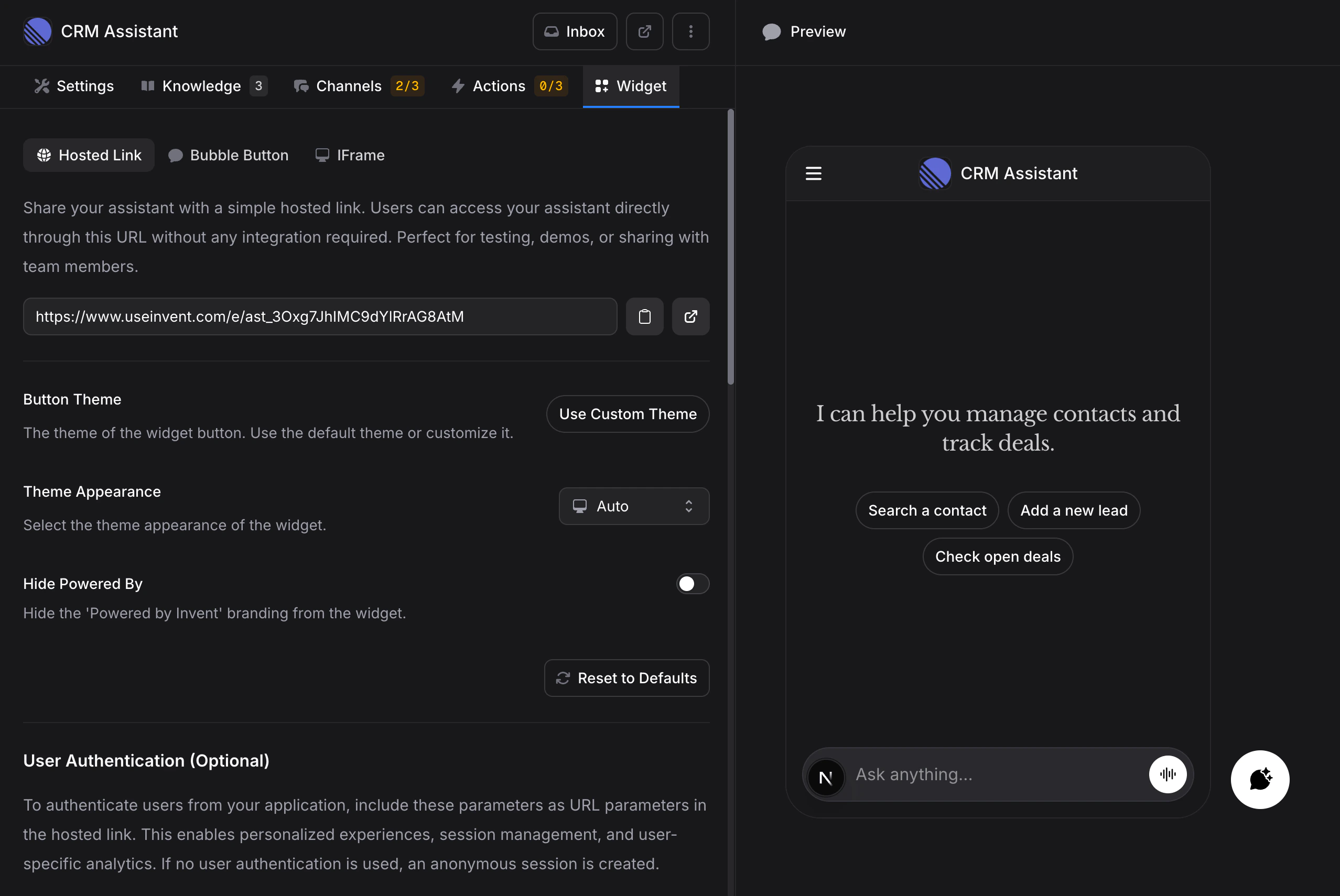
The Widget tab is where you customize your assistant's on-site experience and get the code to add it to your website. Share a link, embed a chat bubble, or add an inline frame. A live preview on the right shows every change as you make it, and you can switch it between the **Chat**, **Omnibar**, **Teaser**, and **Channels** views.

<Frame>
  <img src="https://mintcdn.com/invent/3biOcBj3g_3d_xX2/assets/assistants/widget-overview.png?fit=max&auto=format&n=3biOcBj3g_3d_xX2&q=85&s=d6dba324214f935bf7ff8bebc7495fc9" alt="Widget settings with a live preview of the chat" style={{ maxHeight: '400px' }} width="1800" height="1040" data-path="assets/assistants/widget-overview.png" />
</Frame>

## Embed Methods

The Widget tab has three ways to deploy your assistant:

### Hosted Link

A shareable URL that opens your assistant in a standalone page. No code or integration required.

```
https://www.useinvent.com/e/YOUR_ASSISTANT_ID
```

Copy the link and share it anywhere: send it to customers, embed it in emails, use it for testing, or share it with team members. Anyone with the link can start chatting with your assistant.

<Tip>
  Add a `q` parameter to prefill the message box, for example `.../e/YOUR_ASSISTANT_ID?q=I%20need%20help%20with%20billing`. The text is filled in for the visitor, not sent, so they can edit it before starting the chat. This works on the iframe `src` too.
</Tip>

### Embed Script

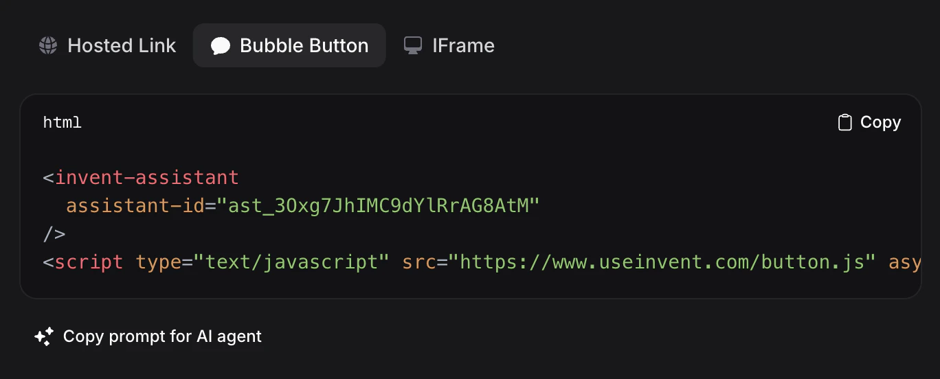
An HTML snippet you paste into your website. By default it adds a floating chat bubble in the corner of your page that customers can click to open a conversation — the shape, colors and behavior all come from your saved widget settings, so you never touch the snippet again.

<Frame>
  <img src="https://mintcdn.com/invent/3biOcBj3g_3d_xX2/assets/assistants/widget-embed-script.png?fit=max&auto=format&n=3biOcBj3g_3d_xX2&q=85&s=ea9e9e068b82a8620fd3ea3732d0045c" alt="Embed Script Code" style={{ maxHeight: '400px' }} width="748" height="334" data-path="assets/assistants/widget-embed-script.png" />
</Frame>

```html theme={"system"}
<invent-assistant assistant-id="YOUR_ASSISTANT_ID"></invent-assistant>
<script type="text/javascript" src="https://www.useinvent.com/embed.js" async defer></script>
```

Copy the snippet and paste it before the closing `</body>` tag on your website. The bubble appears immediately.

<Tip>
  Click **Copy prompt for AI agent** to copy an integration prompt you can paste into AI coding tools like Cursor, Claude Code, etc. It includes the full snippet and instructions for adding the widget to your project.
</Tip>

For platform-specific setup guides (WordPress, Shopify, Next.js, Webflow, and more), see the [install guides](#install-guides) below.

### Omnibar

The same embed script can wear a different shape: a centered "Ask anything" bar at the bottom of your page. Visitors type right into it, and the chat expands around their question. Pick **Omnibar** as the **Default Mode** under **Appearance** to switch existing embeds without touching any code, or force it per page with a `mode="omnibar"` attribute on the element.

```html theme={"system"}
<invent-assistant assistant-id="YOUR_ASSISTANT_ID" mode="omnibar"></invent-assistant>
<script type="text/javascript" src="https://www.useinvent.com/embed.js" async defer></script>
```

<Frame>
  <img src="https://mintcdn.com/invent/3biOcBj3g_3d_xX2/assets/assistants/widget-omnibar.png?fit=max&auto=format&n=3biOcBj3g_3d_xX2&q=85&s=5e5fc6927657757825988f3be7663702" alt="Omnibar focused with suggested messages and channels" style={{ maxHeight: '400px' }} width="1440" height="900" data-path="assets/assistants/widget-omnibar.png" />
</Frame>

Focusing the bar raises your **Suggested Messages** and channel shortcuts above it. Sending a message expands the bar into the full chat panel; the minimize button folds it back down.

<Frame>
  <img src="https://mintcdn.com/invent/3biOcBj3g_3d_xX2/assets/assistants/widget-omnibar-expanded.png?fit=max&auto=format&n=3biOcBj3g_3d_xX2&q=85&s=62d9265c39990524541c8df039a2b825" alt="Omnibar expanded into the chat panel" style={{ maxHeight: '400px' }} width="1440" height="900" data-path="assets/assistants/widget-omnibar-expanded.png" />
</Frame>

* The bar is transparent around its edges and never blocks the page: clicks pass through everywhere the widget is not visible.
* The resting bar types out your suggested messages as its placeholder, so the invitation does the selling.
* Scrolling down folds the bar into a compact centered button (the same bar, morphed smaller); scrolling back up brings it back. Tapping the button reopens the bar, focused and ready to type, and if a reply arrives while folded, the button shows an unread dot. On mobile this is always on; the **Minimize on Scroll** setting extends it to desktop.
* While the suggestions are raised, a grabber handle above them expands the full panel; pressing <kbd>Escape</kbd> folds everything back down.
* The `?q=` parameter prefills the bar the same way it prefills the hosted link.
* On desktop, the chat header includes a shape toggle, so visitors can switch between the omnibar and the bubble button themselves; the widget remembers their pick. Mobile keeps the UI lean: no toggle, the configured mode always applies.

<Tip>
  Set `mode="auto"` (or the **Auto** Default Mode) to let the widget decide: new visitors get the omnibar, and once they have a conversation, later visits show the familiar bubble button instead.
</Tip>

### IFrame

An inline embed that displays your assistant directly within a page, rather than as a floating bubble. Use this when you want the assistant to appear as part of your page layout.

<Frame>
  <img src="https://mintcdn.com/invent/3biOcBj3g_3d_xX2/assets/assistants/widget-iframe.png?fit=max&auto=format&n=3biOcBj3g_3d_xX2&q=85&s=827ffce0e212ac1651e71c6704b0351a" alt="IFrame Code" style={{ maxHeight: '400px' }} width="1368" height="592" data-path="assets/assistants/widget-iframe.png" />
</Frame>

```html theme={"system"}
<iframe
  src="https://www.useinvent.com/e/YOUR_ASSISTANT_ID"
  width="100%"
  height="600"
  title="AI Assistant"
  allow="microphone"
></iframe>
```

This is useful for dedicated support pages, help centers, or any layout where you want the assistant embedded inline.

## Customization

All embed methods share the same settings, grouped into **Appearance**, **Conversation**, **Teaser**, **Channels**, and **Advanced**. Every change shows up in the live preview and is not applied until you click **Save**.

### Appearance

Controls how the widget looks on your site.

* **Default Mode**: the shape the widget starts in, the **Bubble Button** in the corner or the centered **Omnibar**. **Auto** shows the Omnibar until a visitor has a conversation. The resolution order is: the visitor's own header-toggle pick wins (desktop only — mobile has no toggle), then a `mode` attribute on the embed element, then this setting.
* **Bubble Button Position**: the corner for the bubble launcher, **Bottom right** or **Bottom left**. The Omnibar is always centered. A `position` attribute on the embed element overrides it per page.
* **Minimize on Scroll**: folds the Omnibar into its compact button while visitors scroll down on desktop (off by default). On mobile the bar always folds. Scrolling back up brings the bar back; a visitor who dismissed it stays folded until they tap.
* **Theme Appearance**: the color scheme of the chat. **Auto** matches the visitor's system preference, or force **Light** or **Dark**.
* **Accent Color**: used across the widget for the chat button, buttons, links, and your visitors' messages. Click the circle to pick a color or enter a hex value.
* **Bubble Button**: the floating button follows your accent color by default. Set a custom color if you want the button to stand out. The icon color adapts automatically for contrast, so you never set it yourself.

### Conversation

Shapes the first thing visitors see when they open the chat.

* **Greeting**: the welcome message shown at the top of a new conversation.
* **Suggested Messages**: quick replies visitors can tap to start. These also appear alongside the teaser.
* **Dictation**: let visitors dictate messages with their microphone.
* **File Uploads**: let visitors attach files and images to their messages.

### Teaser

A short, proactive invitation that appears next to the closed button to nudge visitors into a conversation. It is on by default and only appears when there is something to show: a greeting or suggested messages.

<Frame>
  <img src="https://mintcdn.com/invent/3biOcBj3g_3d_xX2/assets/assistants/widget-teaser.png?fit=max&auto=format&n=3biOcBj3g_3d_xX2&q=85&s=69faf358ec79dd5c3b9661037dda9a52" alt="Teaser Preview" style={{ maxHeight: '400px' }} width="954" height="1306" data-path="assets/assistants/widget-teaser.png" />
</Frame>

* **Show Teaser**: turn the teaser on. By default it shows your **Greeting**; use **Greeting Override** to show different text just in the teaser.
* **Show on**: which widget modes show the teaser, the Bubble Button, the Omnibar, or both. In omnibar mode the teaser appears as a message right above the bar.
* **Show Suggested Messages**: the suggested messages from the **Conversation** section appear as tappable chips beside the teaser. Tapping one opens the chat and sends it. Choose which modes show them, or turn them off. Defaults to **Bubble Button**: the Omnibar already shows them when focused, independent of this setting.
* **Devices**: where it shows, **Desktop only**, **Mobile only**, or **Desktop and mobile**.
* **Delay**: how long to wait after the page loads before the teaser appears.
* **Frequency**: how often it can show again. **Once per visitor**, **Once per session**, or **Every visit**. Visitors who dismiss it will not see it again (except with **Every visit**).
* **Reset Dismissals**: **Show again to all visitors** brings the teaser back for everyone who dismissed it, starting on their next visit.

### Channels

Offer visitors other ways to reach you from a menu on the widget button. When any channels are configured, tapping the button opens this menu first, with a button to start the chat.

<Frame>
  <img src="https://mintcdn.com/invent/3biOcBj3g_3d_xX2/assets/assistants/widget-channels.png?fit=max&auto=format&n=3biOcBj3g_3d_xX2&q=85&s=9a09b7f1e448f3ad20bc259be0f4aaf7" alt="Channels Preview" style={{ maxHeight: '400px' }} width="954" height="1306" data-path="assets/assistants/widget-channels.png" />
</Frame>

* **Connected channels**: any messaging channels you have connected (WhatsApp, Messenger, Instagram, Telegram) are included automatically and keep their links up to date. Remove one to hide it from the menu.
* **Custom channels**: add a **Link**, **Email**, or **Phone** entry to point visitors anywhere else.
* **Menu Heading**: the text shown above the channels in the menu.
* **Chat Button**: the label for the button that opens the chat.

<Tip>
  Connect messaging channels first under the [Channels](/assistants/channels) tab, then reorder or hide them here.
</Tip>

### Advanced

* **Hide Powered By**: remove the "Powered by Invent" branding from the widget.

  <Info>
    Removing "Powered by" branding requires a [Business or Enterprise plan](/guides/pricing-and-plans).
  </Info>

* **Reset to Defaults**: restore every widget setting, including colors, teaser, and channels, to its default. Nothing changes until you save.

## User Authentication (Optional)

By default, every visitor gets an anonymous session. To identify users and enable personalized experiences, conversation history across sessions, and contact management, add authentication attributes to the widget.

### Authentication Attributes

| Attribute   | Description                                                                                                                                                                  |
| ----------- | ---------------------------------------------------------------------------------------------------------------------------------------------------------------------------- |
| `user-hash` | **Required for authentication.** HMAC-SHA256 hash of the `user-id` using your assistant's secret key. Must be generated on your backend                                      |
| `user-id`   | The unique user identifier from your application. Used for session management, analytics, and maintaining conversation history across sessions                               |
| `user-name` | Display name for the user (full name, first name, username, etc.). Used for personalization in chat messages and [contacts](/guides/audience). URL-encode special characters |

`user-hash` and `user-id` are required together. `user-name` is optional.

### Setting Up Authentication

<Steps>
  <Step title="Generate a Secret Key">
    Scroll to the **Secret Key** section at the bottom of the Widget tab and click **Generate Secret Key**. This creates a unique key for your assistant.

    <Frame>
      <img src="https://mintcdn.com/invent/3biOcBj3g_3d_xX2/assets/assistants/widget-secret-key.png?fit=max&auto=format&n=3biOcBj3g_3d_xX2&q=85&s=fd889d1968afff2cccf2cf65fe43077b" alt="Secret Key" style={{ maxHeight: '400px' }} width="1390" height="406" data-path="assets/assistants/widget-secret-key.png" />
    </Frame>

    Copy the key and store it securely on your backend. Never expose it in client-side code.
  </Step>

  <Step title="Generate the User Hash on Your Backend">
    Use the secret key to create an HMAC-SHA256 hash of the user's ID. Here is an example in Node.js:

    ```javascript theme={"system"}
    import crypto from 'crypto';

    const secretKey = 'YOUR_SECRET_KEY';
    const userId = 'user_123';

    function generateUserHash(userId, secretKey) {
      return crypto
        .createHmac('sha256', secretKey)
        .update(userId)
        .digest('hex');
    }

    const userHash = generateUserHash(userId, secretKey);
    ```

    <Warning>
      Always generate the hash on your server. Never include the secret key in client-side JavaScript.
    </Warning>
  </Step>

  <Step title="Add Attributes to the Widget">
    Pass the authentication attributes to the widget element:

    ```html theme={"system"}
    <invent-assistant
      assistant-id="YOUR_ASSISTANT_ID"
      user-id="user_123"
      user-hash="GENERATED_HASH"
      user-name="Sarah Miller"
    ></invent-assistant>
    <script type="text/javascript" src="https://www.useinvent.com/embed.js" async defer></script>
    ```
  </Step>
</Steps>

For more authentication examples in other languages (PHP, Python, Ruby, Go) and framework-specific guides, see the [install guides](#install-guides) below.

## Element Attributes

The `<invent-assistant>` element reads a fixed set of attributes. Anything else is ignored.

| Attribute                           | Values                      | Description                                                                             |
| ----------------------------------- | --------------------------- | --------------------------------------------------------------------------------------- |
| `assistant-id`                      | your assistant ID           | **Required.** Identifies which assistant to load                                        |
| `mode`                              | `button`, `omnibar`, `auto` | Overrides the **Default Mode** for this page                                            |
| `position`                          | `right`, `left`             | Overrides the **Bubble Button Position** for this page                                  |
| `theme-appearance`                  | `auto`, `light`, `dark`     | Overrides the **Theme Appearance** for this page                                        |
| `theme-button-background-color`     | hex color                   | Overrides the bubble button color. The icon color is derived automatically for contrast |
| `hide-powered-by`                   | `true`                      | Hides the "Powered by Invent" branding (Business or Enterprise plan)                    |
| `user-id`, `user-hash`, `user-name` | strings                     | Authentication attributes (see above)                                                   |

<Note>
  The button icon color is always computed for contrast, so there is no `theme-button-color` attribute. The widget also has no inbound page-context API, so `window.inventContext` and similar globals have no effect.
</Note>

## Install Guides

Step-by-step setup guides for popular platforms and frameworks.

### Frameworks

<CardGroup cols={3}>
  <Card title="Next.js" icon="react" href="/assistants/widget/install/nextjs" />

  <Card title="Remix" icon="r" href="/assistants/widget/install/remix" />

  <Card title="Nuxt" icon="n" href="/assistants/widget/install/nuxt" />

  <Card title="Gatsby" icon="g" href="/assistants/widget/install/gatsby" />

  <Card title="SvelteKit" icon="code" href="/assistants/widget/install/sveltekit" />

  <Card title="Astro" icon="rocket" href="/assistants/widget/install/astro" />
</CardGroup>

### Content Management

<CardGroup cols={3}>
  <Card title="WordPress" icon="wordpress" href="/assistants/widget/install/wordpress" />

  <Card title="Webflow" icon="w" href="/assistants/widget/install/webflow" />

  <Card title="Contentful" icon="c" href="/assistants/widget/install/contentful" />

  <Card title="Ghost" icon="ghost" href="/assistants/widget/install/ghost" />

  <Card title="Drupal" icon="drupal" href="/assistants/widget/install/drupal" />

  <Card title="Joomla" icon="joomla" href="/assistants/widget/install/joomla" />
</CardGroup>

### Website Builders

<CardGroup cols={3}>
  <Card title="Framer" icon="f" href="/assistants/widget/install/framer" />

  <Card title="Wix" icon="wix" href="/assistants/widget/install/wix" />

  <Card title="Squarespace" icon="squarespace" href="/assistants/widget/install/squarespace" />

  <Card title="Weebly" icon="w" href="/assistants/widget/install/weebly" />
</CardGroup>

### E-commerce

<CardGroup cols={3}>
  <Card title="Shopify" icon="shopify" href="/assistants/widget/install/shopify" />
</CardGroup>

## Next Steps

<CardGroup cols={2}>
  <Card title="Channels" icon="tower-broadcast" href="/assistants/channels">
    Connect your assistant to WhatsApp, Instagram, Messenger, and other messaging platforms
  </Card>

  <Card title="Routing" icon="users" href="/assistants/routing">
    Hand off conversations to human teammates when needed
  </Card>
</CardGroup>