

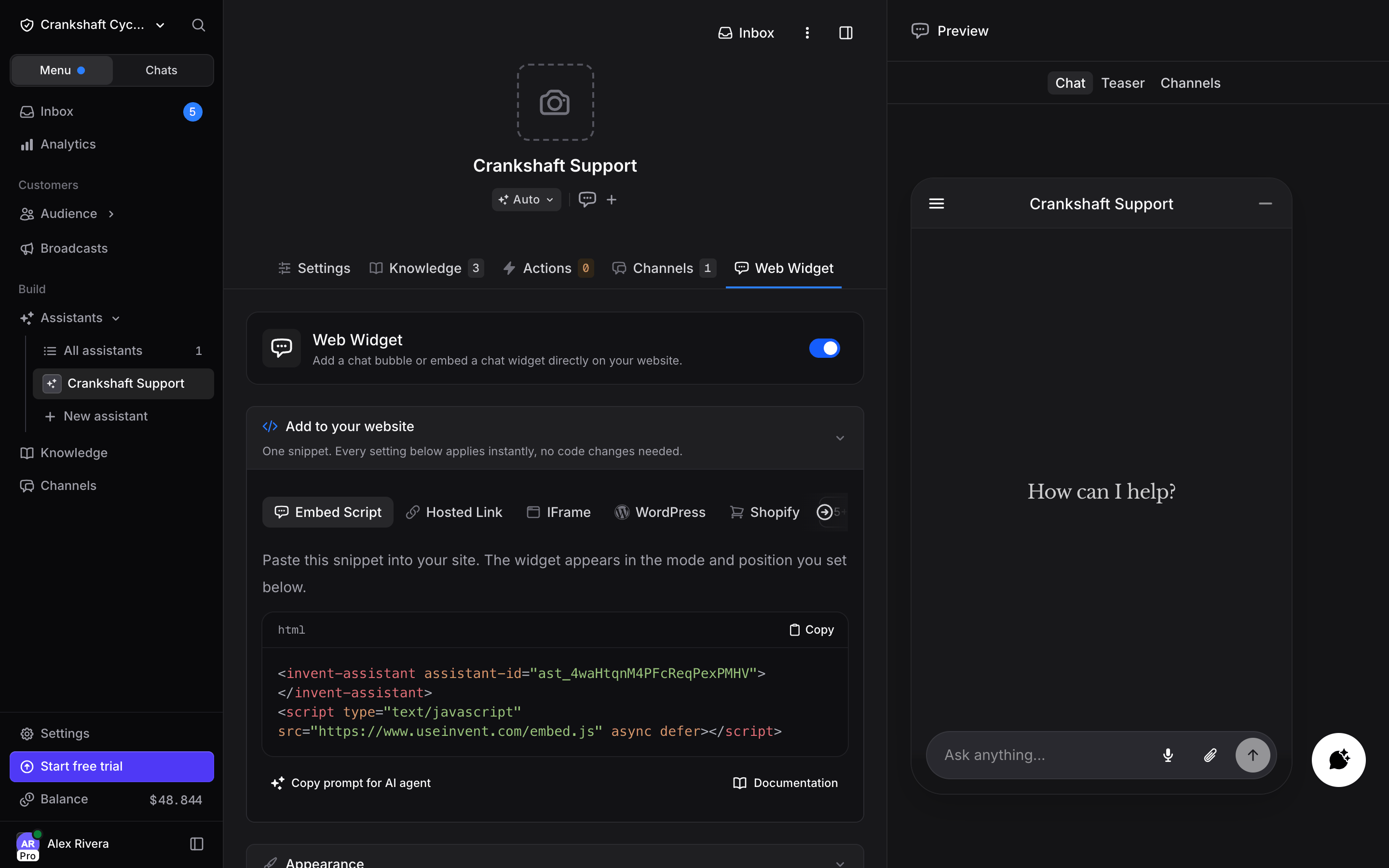
Turning the Widget On or Off
The Web Widget card at the top of the Widget tab is a switch. A new assistant starts with it off, so nothing shows on your site until you turn it on. The same switch is on the Web Widget card of the assistant’s Channels tab and on the assistant’s row under Web Widget on the organization’s Channels page. Only assistant managers can flip it. Picking Web Widget from the Connect channel menu in the assistant header also turns it on.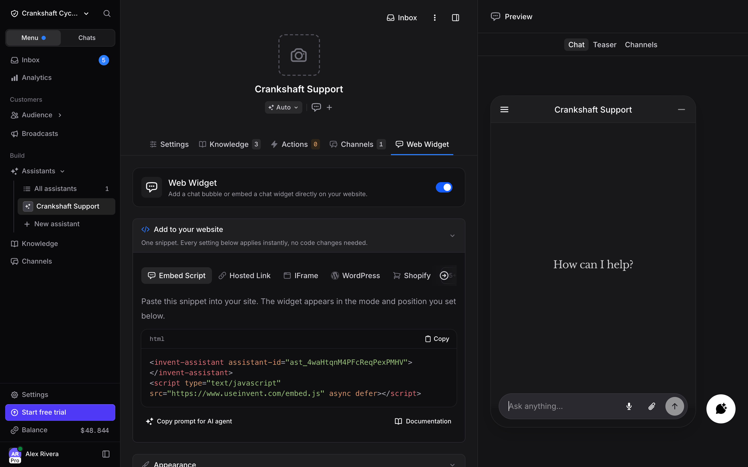
- An installed embed snippet stays hidden. Leave the code on your site; the bubble is back the next time the page loads after you switch the widget on again.
- The hosted link and the iframe show a “Chat unavailable” screen.
- New widget conversations are refused.
- The Web Widget tab disappears from the assistant’s tabs. Switch the widget back on from the Channels tab.
Embed Methods
The Widget tab has three ways to deploy your assistant:Hosted Link
A shareable URL that opens your assistant in a standalone page. No code or integration required.Embed Script
An HTML snippet you paste into your website. By default it adds a floating chat bubble in the corner of your page that customers can click to open a conversation. The colors and behavior all come from your saved widget settings, so you never touch the snippet again.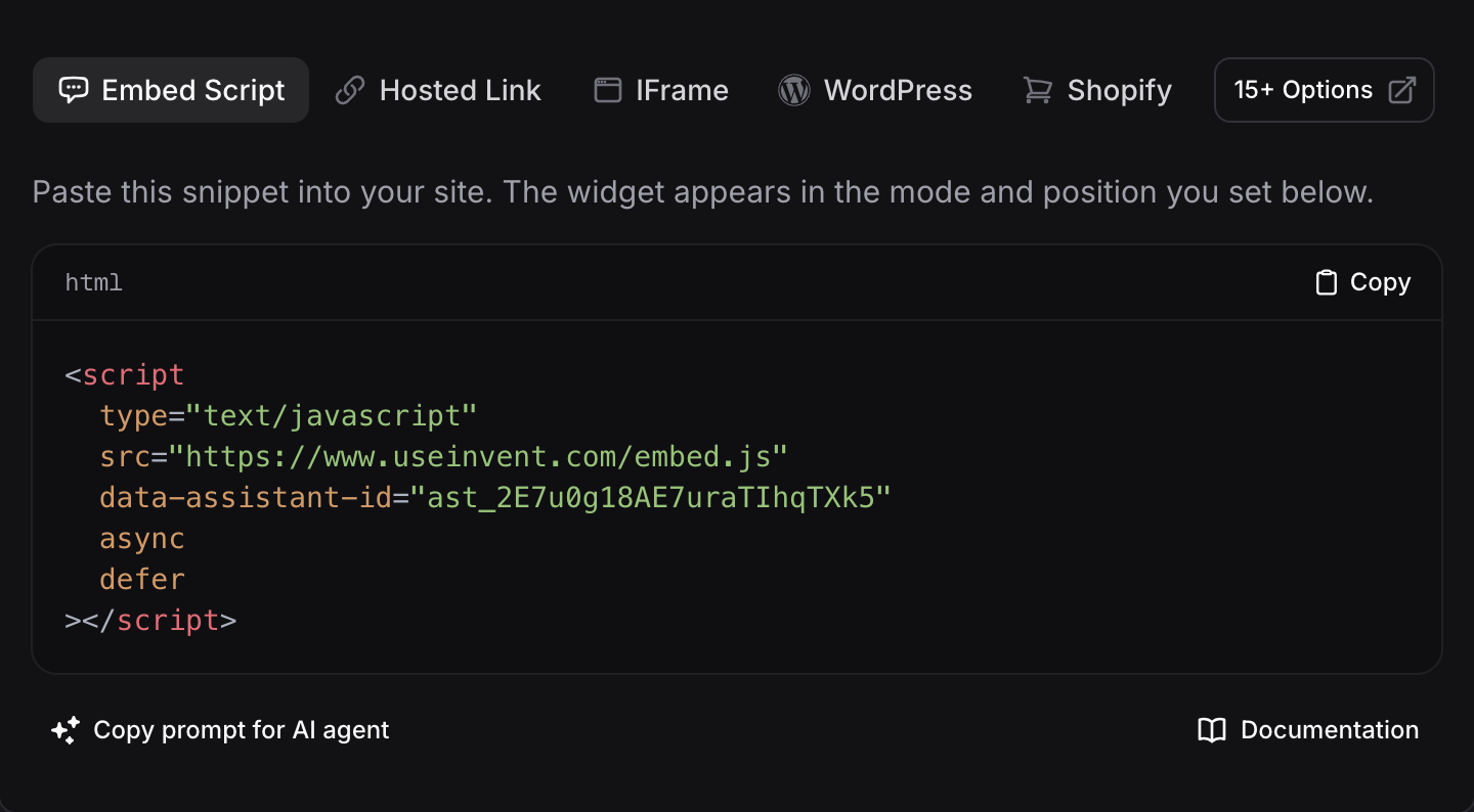
</body> tag on your website. The bubble appears immediately.
If your site uses a cookie consent tool (such as Cookiebot) and the bubble does not appear, paste the snippet exactly as copied (some site builders change its quotes), and mark it as necessary or allowed in the consent tool so it is not blocked.
Google Tag Manager
Google Tag Manager removes thedata-* attributes from a pasted script tag, so the widget would not know which assistant to load. Create a Custom HTML tag with this code instead, and fire it on All Pages:
script.setAttribute('data-mode', 'omnibar');.
For platform-specific setup guides (WordPress, Shopify, Next.js, Webflow, and more), see the install guides below.
Omnibar
The same embed script can wear a different shape: a centered “Ask anything” bar at the bottom of your page. Visitors type right into it, and the chat expands around their question. The shape is chosen on the script tag only: add adata-mode="omnibar" attribute to it. Without the attribute, the widget is the bubble button.
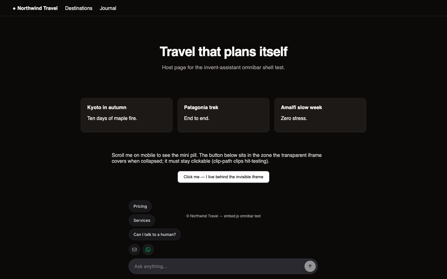
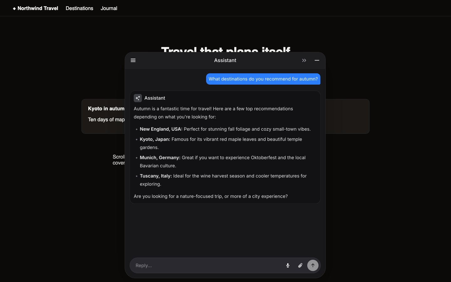
- The bar is transparent around its edges and never blocks the page: clicks pass through everywhere the widget is not visible.
- The resting bar types out your suggested messages as its placeholder, so the invitation does the selling.
- On mobile, scrolling down folds the bar into a compact centered button (the same bar, morphed smaller); scrolling back up brings it back. Tapping the button reopens the bar, focused and ready to type, and if a reply arrives while folded, the button shows an unread dot. On desktop the bar stays in place.
- While the suggestions are raised, a grabber handle above them expands the full panel; pressing Escape folds everything back down.
- The
?q=parameter prefills the bar the same way it prefills the hosted link.
IFrame
An inline embed that displays your assistant directly within a page, rather than as a floating bubble. Use this when you want the assistant to appear as part of your page layout.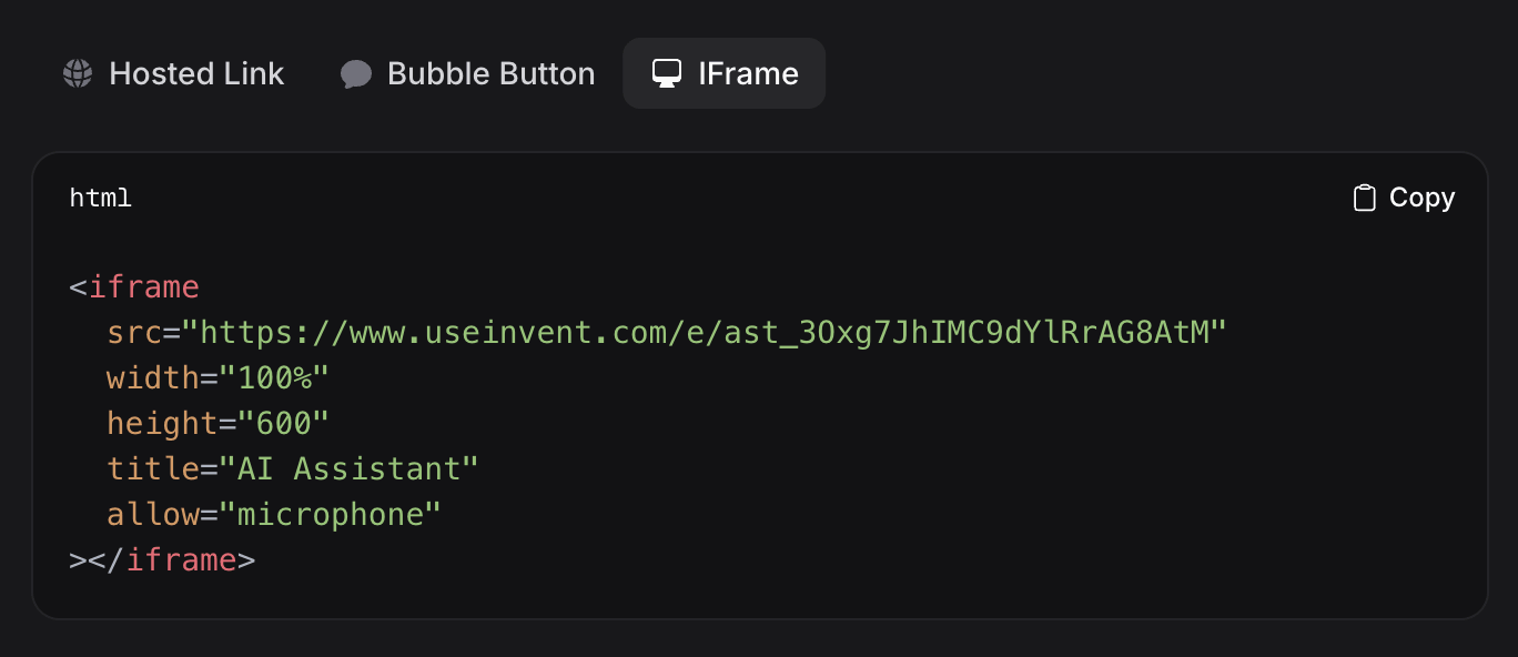
Customization
All embed methods share the same settings, grouped into Appearance, Conversation, Teaser, Channels, and Advanced. Every change shows up in the live preview and is not applied until you click Save.Appearance
Controls how the widget looks on your site.- Bubble Button Position: the corner for the bubble launcher, Bottom right or Bottom left. The Omnibar is always centered. A
data-positionattribute on the script tag overrides it per page. - Theme Appearance: the color scheme of the chat. Auto matches the visitor’s system preference, or force Light or Dark.
- Accent Color: used across the widget for the chat button, buttons, links, and your visitors’ messages. Click the circle to pick a color or enter a hex value.
- Bubble Button: the floating button follows your accent color by default. Set a custom color if you want the button to stand out. The icon color adapts automatically for contrast, so you never set it yourself.
Conversation
Shapes the first thing visitors see when they open the chat.- Greeting: the welcome message shown at the top of a new conversation.
- Suggested Messages: quick replies visitors can tap to start. These also appear alongside the teaser.
- Dictation: let visitors dictate messages with their microphone.
- File Uploads: let visitors attach files and images to their messages.
Teaser
A short, proactive invitation that appears next to the closed button to nudge visitors into a conversation. It is on by default and only appears when there is something to show: a greeting or suggested messages.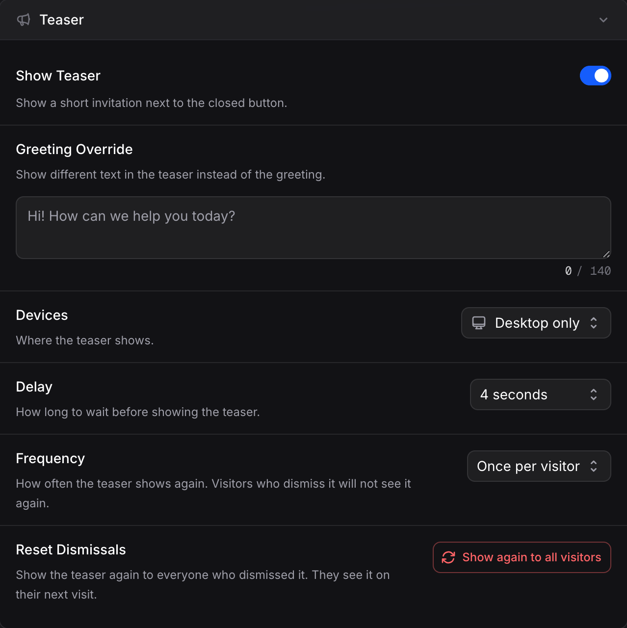
- Show Teaser: turn the teaser on. By default it shows your Greeting; use Greeting Override to show different text just in the teaser. The suggested messages from the Conversation section appear as tappable chips beside it; tapping one opens the chat and sends it.
- Devices: where it shows, Desktop only, Mobile only, or Desktop and mobile.
- Delay: how long to wait after the page loads before the teaser appears.
- Frequency: how often it can show again. Once per visitor, Once per session, or Every visit. Visitors who dismiss it will not see it again (except with Every visit).
- Reset Dismissals: Show again to all visitors brings the teaser back for everyone who dismissed it, starting on their next visit.
Channels
Offer visitors other ways to reach you from a menu on the widget button. When any channels are configured, tapping the button opens this menu first, with a button to start the chat.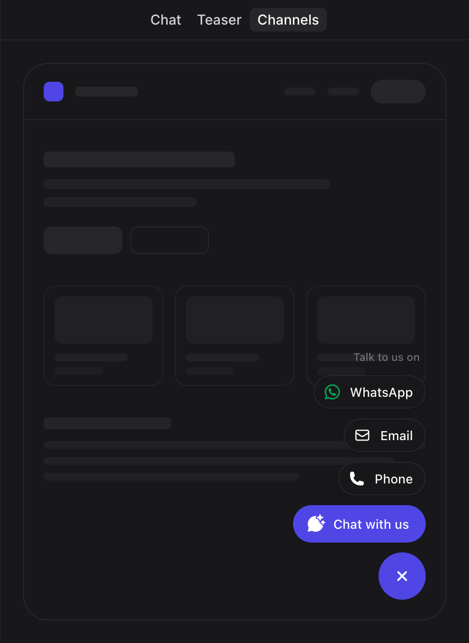
- Connected channels: any messaging channels you have connected (WhatsApp, Messenger, Instagram, Telegram) are included automatically and keep their links up to date. Remove one to hide it from the menu.
- Custom channels: add a Link, Email, or Phone entry to point visitors anywhere else.
- Menu Heading: the text shown above the channels in the menu.
- Chat Button: the label for the button that opens the chat.
Advanced
-
Hide Powered By: remove the “Powered by Invent” branding from the widget.
Removing “Powered by” branding requires a Business or Enterprise plan.
- Reset to Defaults: restore every widget setting, including colors, teaser, and channels, to its default. Nothing changes until you save.
User Authentication (Optional)
By default, every visitor gets an anonymous session. To identify users and enable personalized experiences, conversation history across sessions, and contact management, add authentication attributes to the widget.Authentication Attributes
data-user-hash and data-user-id are required together. data-user-name is optional.
Setting Up Authentication
1
Generate a Secret Key
Scroll to the Secret Key section at the bottom of the Widget tab and click Generate Secret Key. This creates a unique key for your assistant.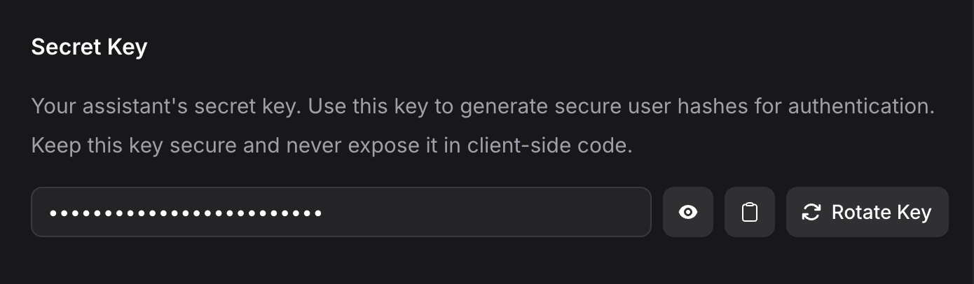
2
Generate the User Hash on Your Backend
Use the secret key to create an HMAC-SHA256 hash of the user’s ID. Here is an example in Node.js:
3
Add Attributes to the Widget
Pass the authentication attributes to the script tag:
Script Attributes
The script tag reads a fixed set of attributes. Anything else is ignored.The button icon color is always computed for contrast, so there is no
data-theme-button-color attribute. The widget also has no inbound page-context API, so window.inventContext and similar globals have no effect.Install Guides
Step-by-step setup guides for popular platforms and frameworks.Frameworks
Next.js
Remix
Nuxt
Gatsby
SvelteKit
Astro
Content Management
WordPress
Webflow
Contentful
Ghost
Drupal
Joomla
Website Builders
Framer
Wix
Squarespace
Weebly
E-commerce
Shopify
Next Steps
Channels
Connect your assistant to WhatsApp, Instagram, Messenger, and other messaging platforms
Routing
Hand off conversations to human teammates when needed